Case Study
Grounded in concept:our logo design process
Logos with YYES
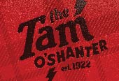
Occasionally logos go big: the Tam O'Shanter restaurant sign in classic neon on Los Feliz Boulevard in Los Angeles. Photo courtesy of Ryan Tanaka.
Start to finish: Logos with YYES
Great logos are deceptively simple but always begin with a strong concept.
A logo can't tell an organization's whole story, but over time it will grow to remind people of positive brand associations. A logo begins with the right idea, follows through with smart execution, and is completed with sharp applications.
That's why a logo is an investment in brand that, if done right the first time, amortizes over years as it supports the brand it represents.
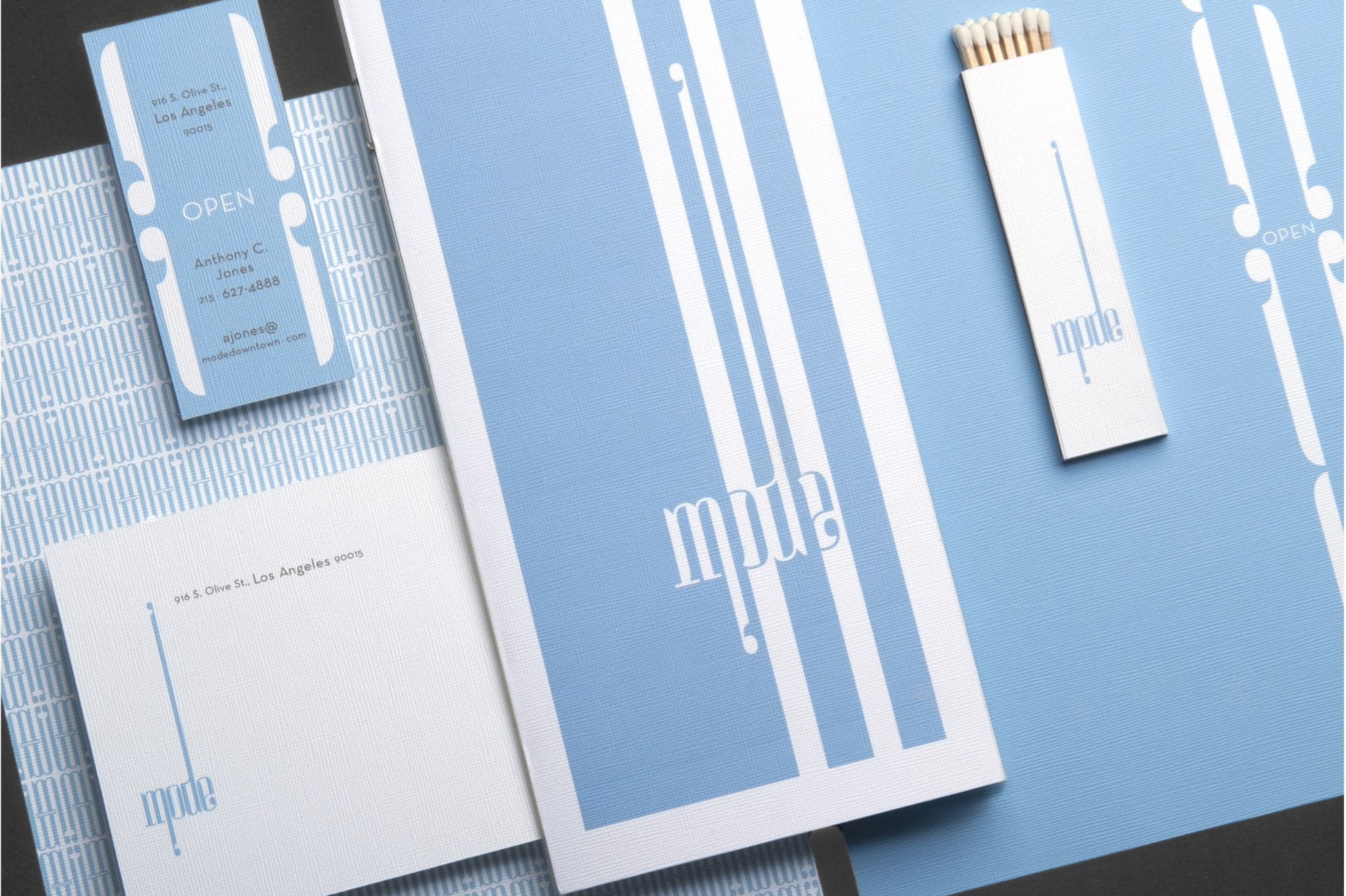

Our logo for French restaurant Mode in Los Angeles, based on the concept of a Paris fashion runway.
Research and discovery lead every logo project. We interview key opinion leaders, learn about brand attributes, and come to understand the brand's sector. We seek to learn things like personal preferences along with what major competitors are doing well.
Research and discovery concludes with a creative brief for the logo, which outlines the project's objectives, parameters, and desired outcomes. The brief then becomes our checkpoint for creative decisions going forward.
Concepting begins with pen and paper. A strong idea doesn't depend on details or techniques: it needs to be evident at first glance. The process of working rough lets us rapidly iterate and confirm (or, more likely, reject) ideas before spending any time refining.
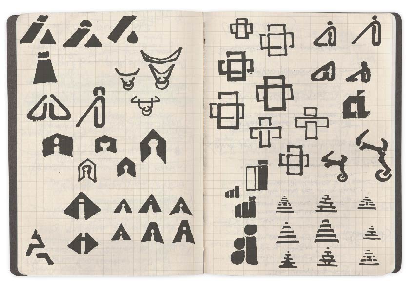

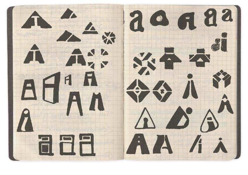

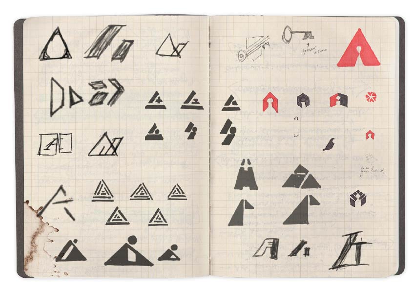

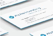
Initial concept sketches from the Alpha Investing logo iteration process.
Execution begins after a set of plausible concepts emerge. We take pen and paper sketches into the computer and continue iterating. Inevitably, ideas that seemed strong on paper fail to synthesize while other solutions come to the forefront.
In this stage, we also research and consider an array of fonts to find type that's appropriate to the client's business. Finding and balancing typography with an icon and even balancing the words within a name is nuanced and takes considerable attention to detail.
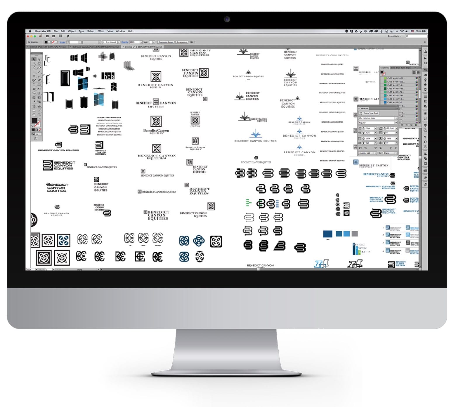

Concepts that make it past the pen-and-paper stage are brought into the computer for refinement, where iteration continues.
The first logo presentation usually involves a series of concepts, well executed, drawn up in crisp black-and-white. Following client feedback, we return to iterate further and refine selected concepts.
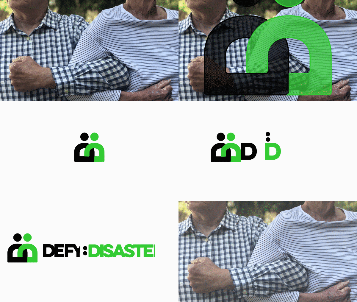

Our logo for disaster relief organization Defy:Disaster was based on the idea of people unifying together to overcome natural and manmade disasters.
Finalizing the logo often takes several subsequent presentations, often including mockups in hypothetical scenarios to contextually illustrate the logo in situ. We develop or apply the brand color palette to the new logo and often advise on typeface pairings for brand communications.
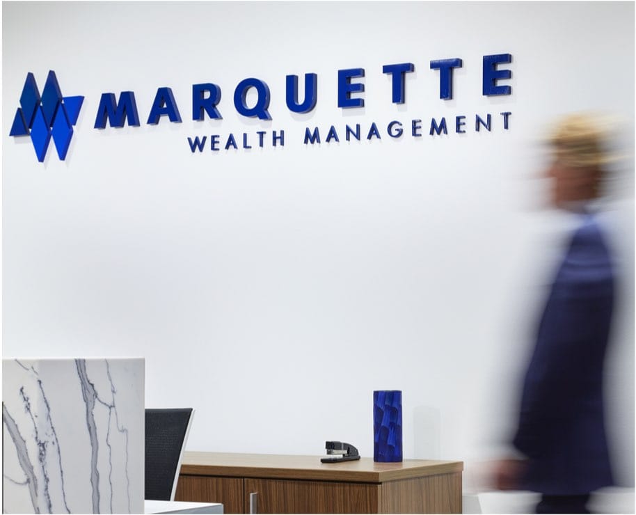

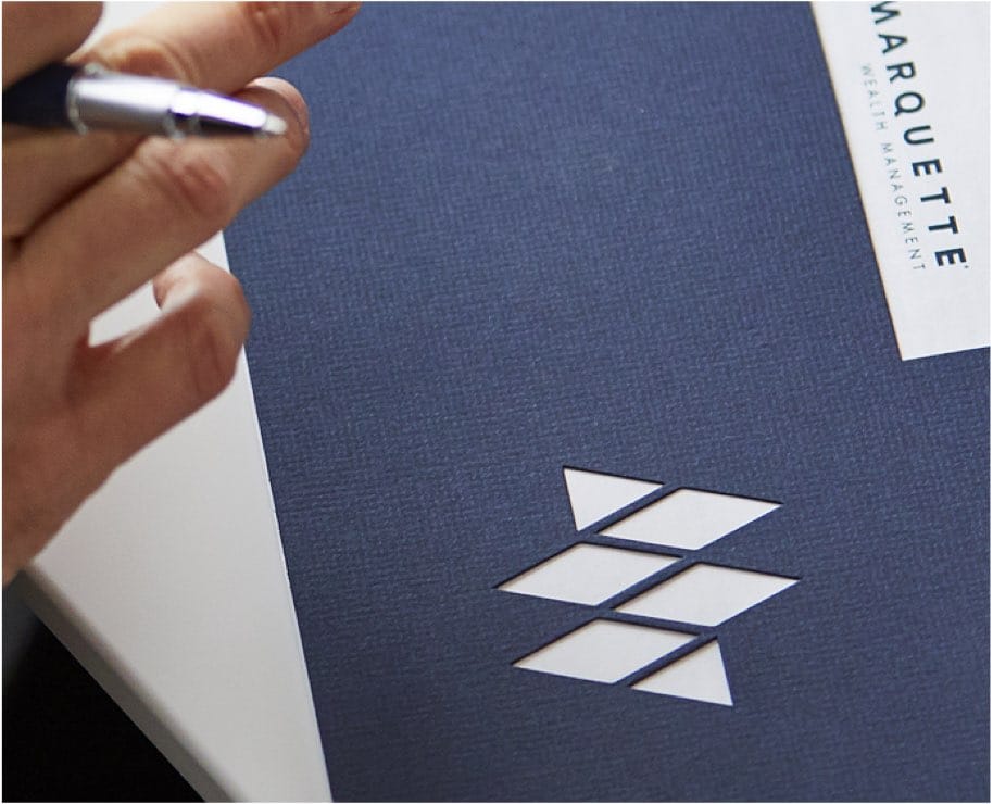

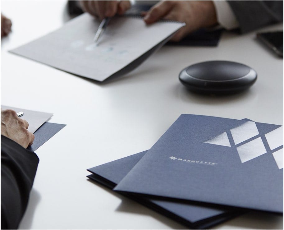

Applications of the Marquette Wealth Management logo ranged from a painted metal lobby sign, to a die-cut presentation cover (center), to an engraved and foil-stamed presentation folder (right).
Applying the logo becomes an ongoing discipline. From business cards and letterhead, to building signs, to digital animations, we can guide the process of realizing sharp logo applications that elevate the perception of your brand.
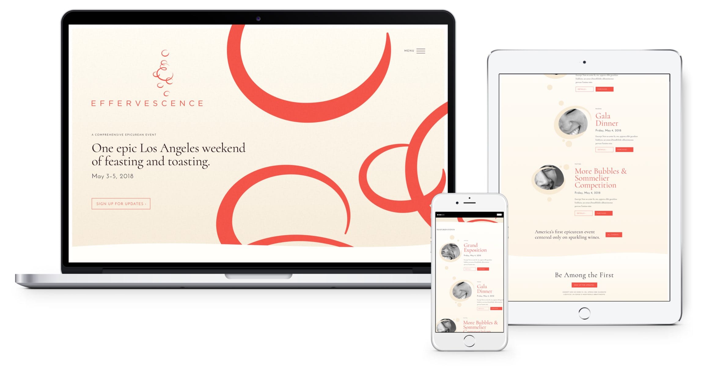

For Effervescence, a Champagne-centric event in Los Angeles, the logo became both an animation of rising bubbles on the landing page as well as a graphic asset throughout its website.
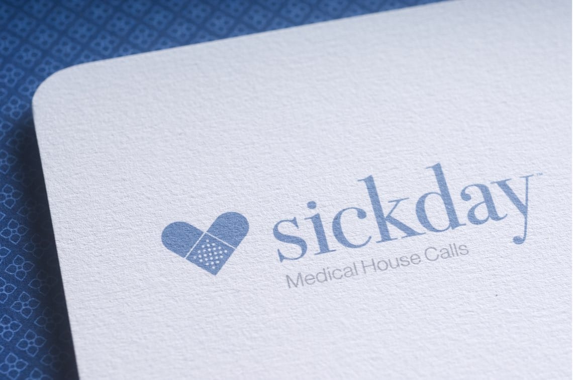

Our logo for medical housecall provider Sickday reflects its compassionate approach to caring for patients. Adding a round die-cut to the corner of cards brings an extra level of customization to logo applications.
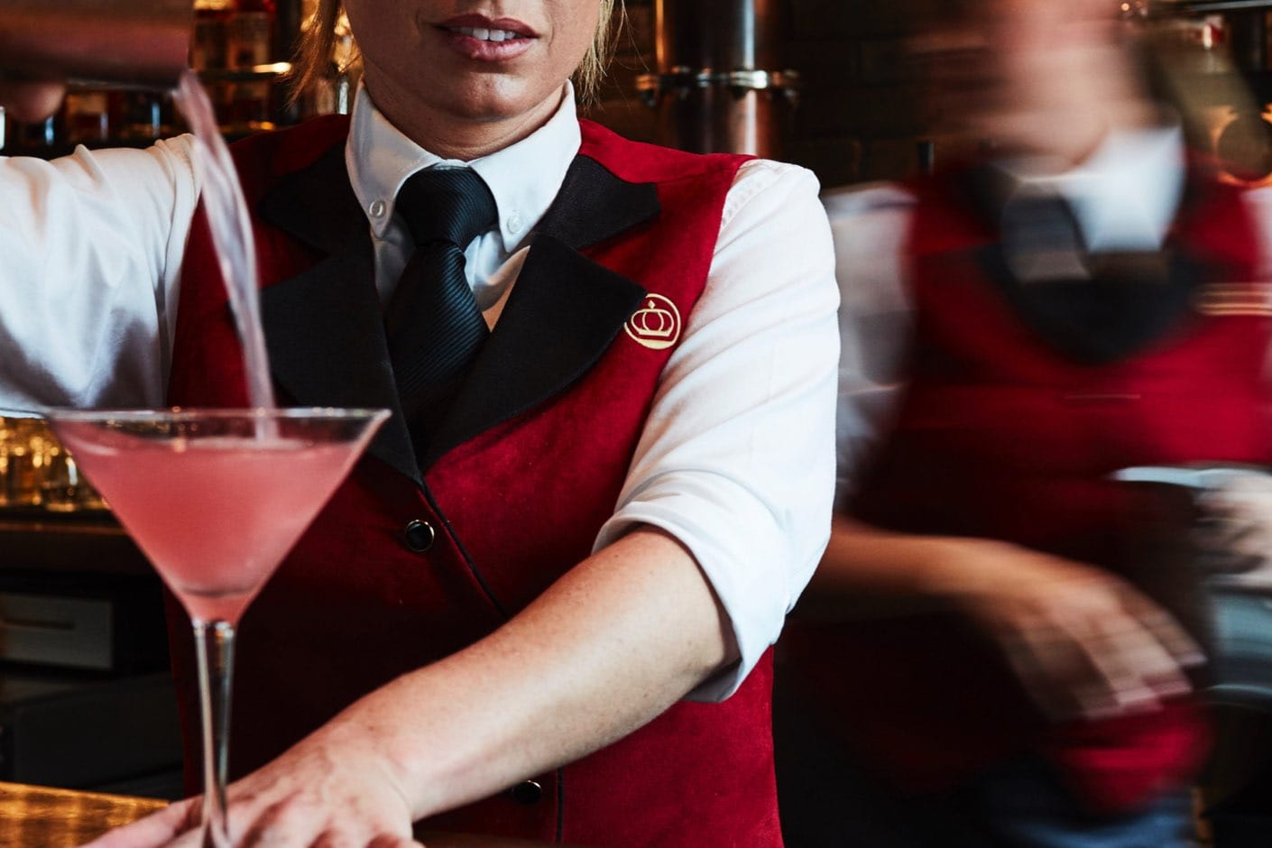

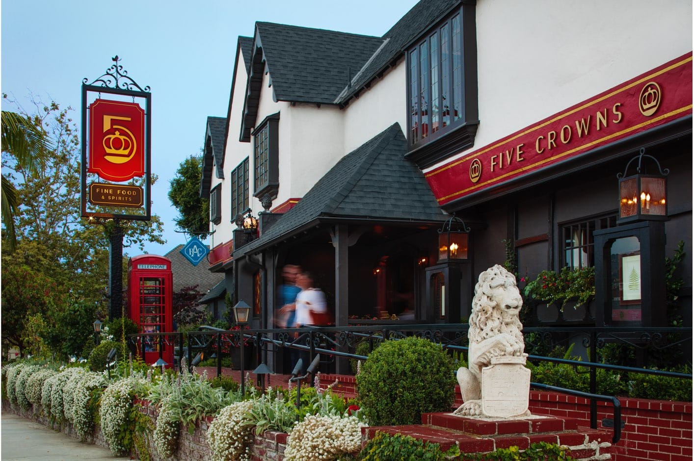

Logos have to be able to expand with the brand they represent. For the restaurant Five Crowns, our logo for the rebrand had to complement an existing sign structure, expand to be painted on the front of the building, and reduce to embroider on servers' uniforms.


Often, visualizations of hypothetical logo applications can help drive home a concept and illustrate the logo's flexibility.
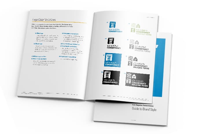

The final deliverable of any logo project is a style and use guide. A simple guide offers straightforward logo application advice and color breakdowns for PMS, CMYK, and RGB, whereas a more detailed guide may delve into deeper brand systems like typography and imagery.
20 years of logos at YYES
We take pride in not having a house style, instead delivering marks that are appropriate to each client, every time.
Here's a look at some of our favorites since our founding in 2000, for clients ranging from financial to hospitality, entertainment to institutions.
