


Brand Case Study
Rewinding a 75-year brand timelineThe Tam O’Shanter
Brand Strategy · Messaging · Logo Design · Identity System · Menu Design · Collateral Design · Signage
Rebrand for an historic, beloved Los Angeles restaurant
The Tam O'Shanter is a family-run, Scottish-inspired pub and a Los Angeles favorite since the day it opened its doors.
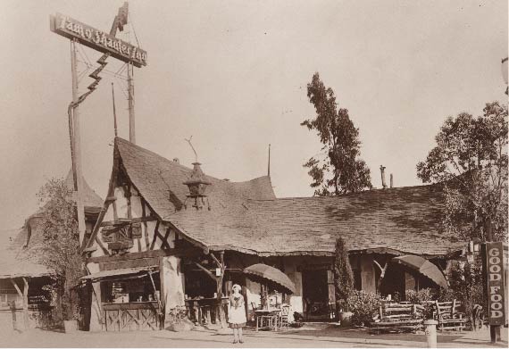
In 1922, owners Lawrence Frank and Walter Van de Kamp commissioned architect and set designer Harry Oliver to build them a "Storybook Style" restaurant, aided by movie studio carpenters. Once a favorite lunch spot for Walt Disney and his animators (ask for table 31 for a view that may have inspired Snow White's cottage), Hollywood elite including Mary Pickford, Douglas Fairbanks, and John Wayne used to escape nearby studio lots to wine and dine at the Tam.
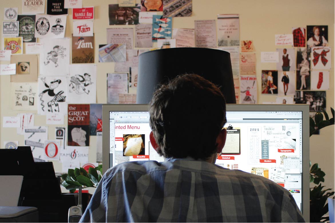
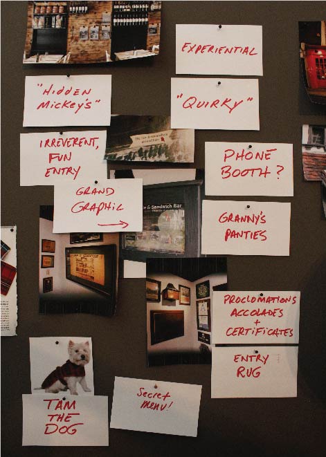
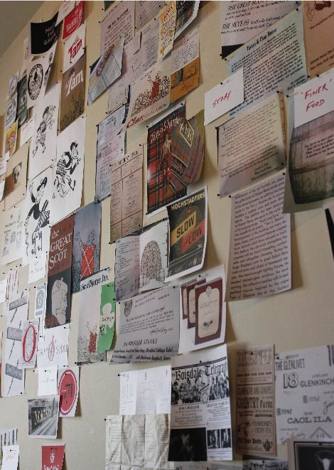
Discovery
We conducted interviews with leadership and staff to learn about the restaurant's DNA. A trove of historic ephemera provided a foundation for our work and insight into the original vision for the restaurant. We then papered the studio with clippings and sketches to inspire our process.
Revisiting history
To approach a rebrand for a restaurant nearly 100 years old, we started by looking to the past. A sense of fun and escapism embraced by guests rose as a central theme to our work. By keeping an eye on where the brand had come from, we worked to recapture the original spirit of the restaurant.
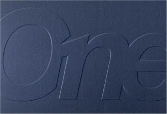
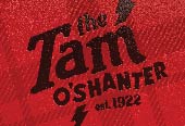
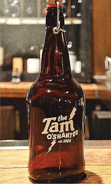
The logo
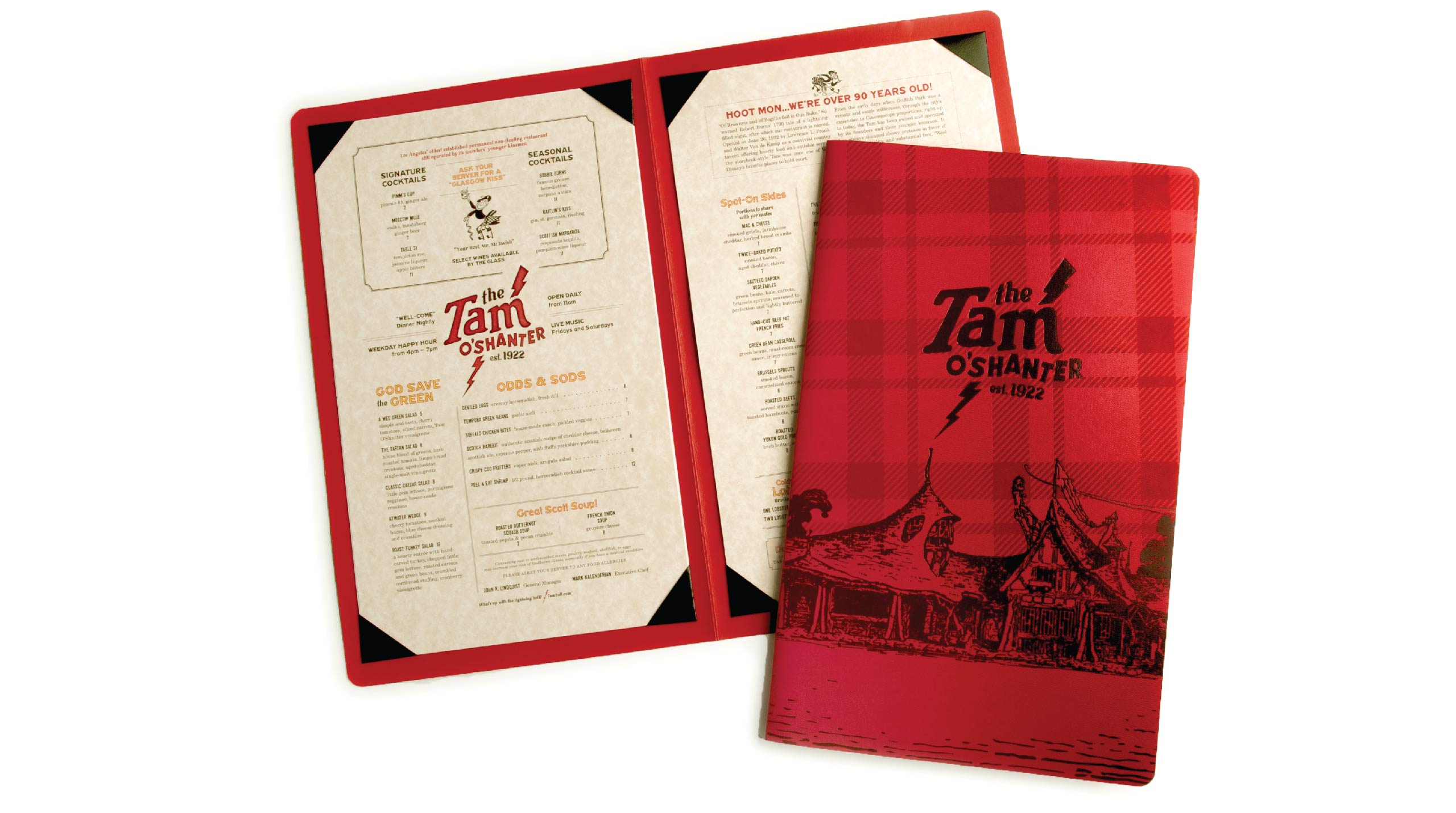
A logo from the restaurantu's past provided a spark of inspiration for our work. Combining three whimsical type styles and manually adding imperfections to the letterforms, we developed a variable logo that at once spoke of quirky history and playful escapades.
Historic photos of the restaurant show a neon lightning bolt beckoning diners to the Tam, a reference to the restaurantu's namesake poem by Scottish poet Robert Burns, so we incorporated a bolt into the updated logo and alibi branding.
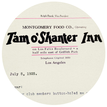
A letterhead from 1925 inspired the new logo’s sense of whimsy.
The existing logo by the design office Saul Bass was outdated and lacked reference to the restaurant’s storied history.
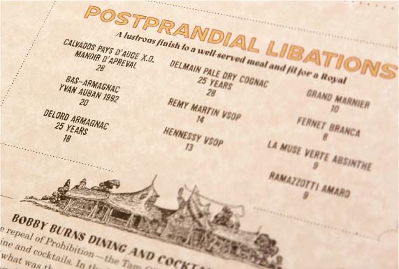
The menu
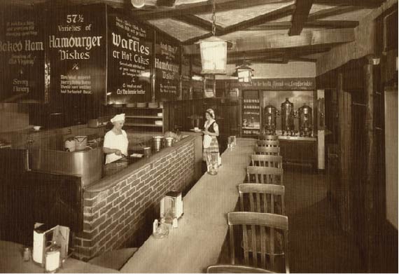
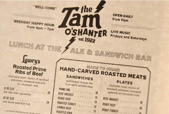
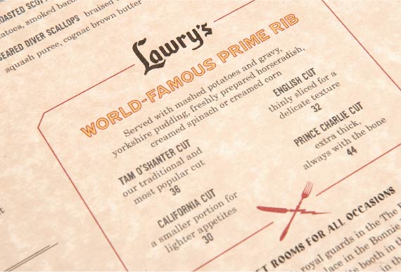
Every restaurant guest holds a menu, making it a valuable touchpoint for expressing key qualities of the brand. We mixed typefaces, colors, and border styles to infuse the pages with a degree of eclecticism. The reusable shell holds the menu cards, which we pre-printed in color and which Tam staff then print in-house daily and insert into the shell.
Paper with an aged look in a Pajco-Lexide carrier shell that evokes vintage diners sets the stage for menus that could be original to the restaurant. A custom tartan pattern telegraphs the restaurant's Scottish flair.
Menus:
- 8-1/2"x14"
- Mohawk Skytone paper
- 4 PMS colors offset printed
- Imprinted daily by Tam staff
Carriers:
- 2-color foil stamping
- Die-cut Pajco-Lexide
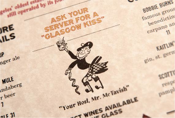
We revived other historic Tam elements from the archives—like its mythic Scottish host, Mr. McTavish—and wrote new voice elements for the brand to give guests a touch of Scottish whimsy. Ask your server for a "Glasgow Kiss!"
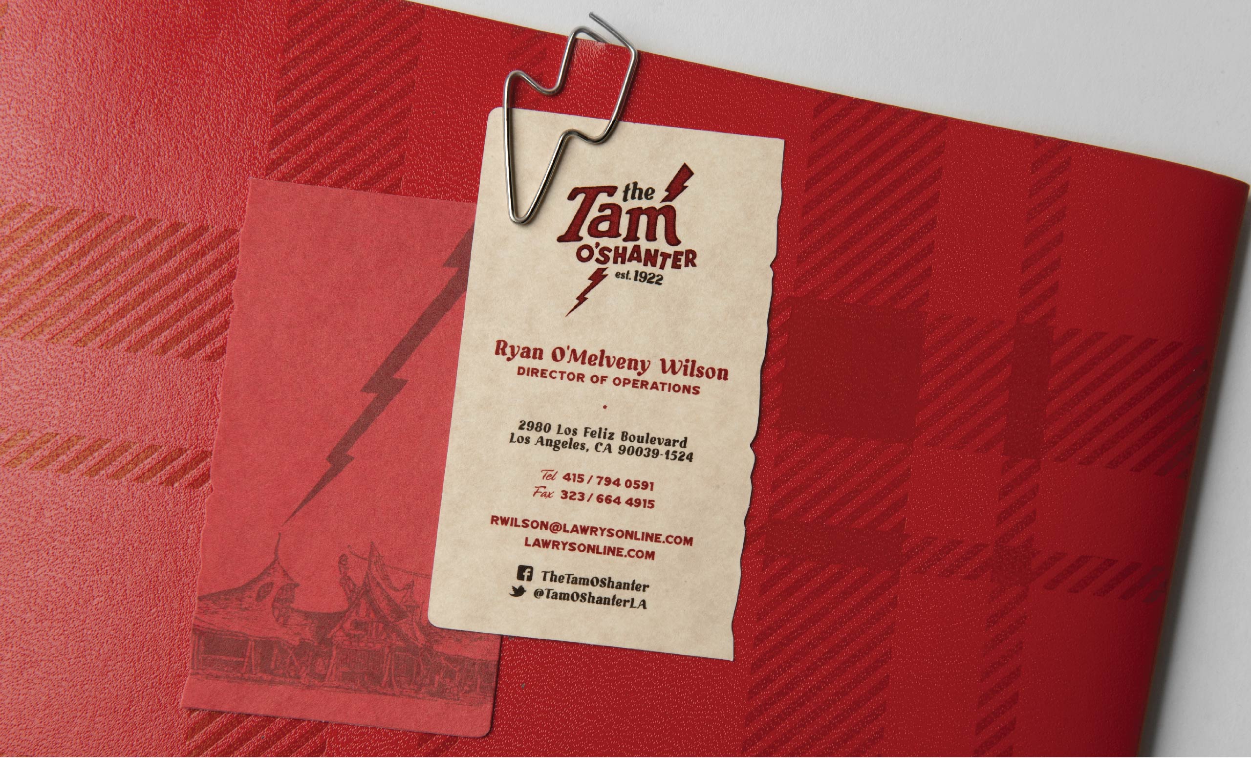
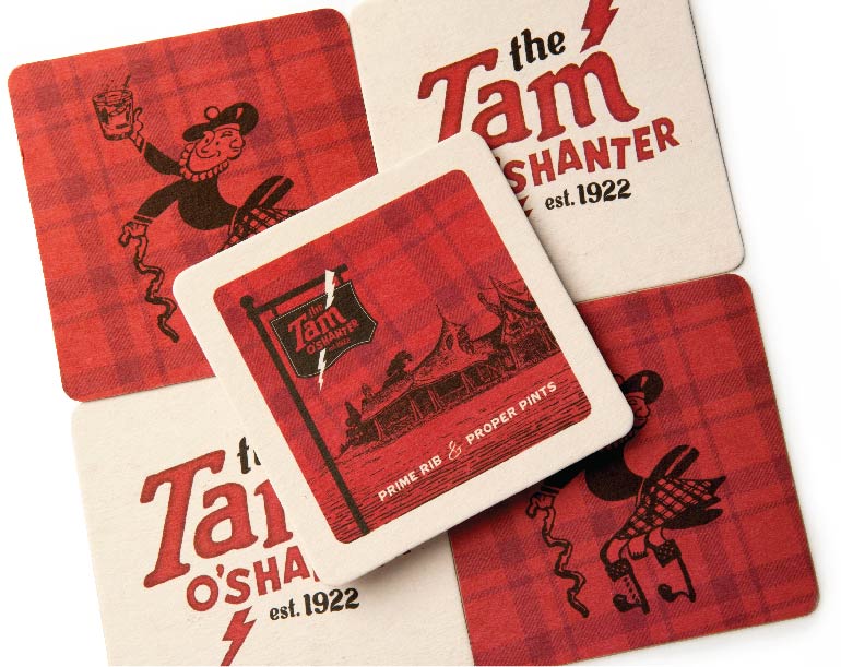
Custom elements of the brand include specially die cut business cards, lightning bold paper clips for menu specials cards, and brand applications including matchbooks, swizzle sticks, coasters, and bottles.
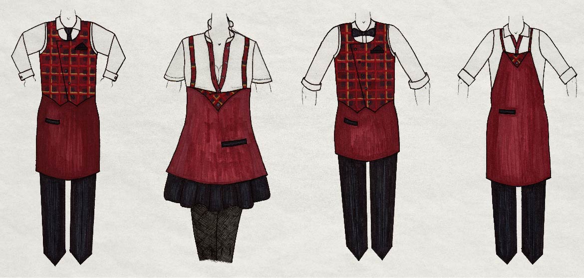
Dressing the Part
Staff uniforms have always been a part of Tam history. We looked to traditional Scottish fabrics like tweed and created a tartan pattern unique to the restaurant, then worked with fashion designer Christopher Fleming to realize the new uniforms.
Boulevard Beacon
We worked with Neiman & Company to navigate strict signage regulations imposed by the City of Glendale to replace the Tamu2019s existing pole sign with a brilliant neon beacon. The sign can be seen from blocks away and has been heralded as a cornerstone element of Los Feliz Boulevard's revitalization.
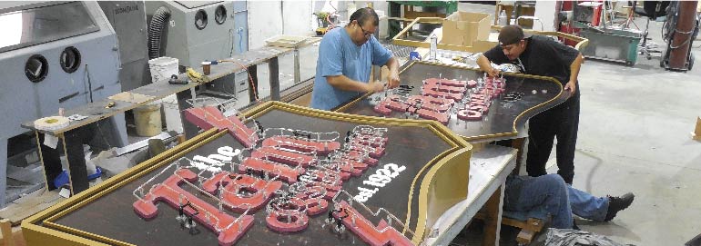
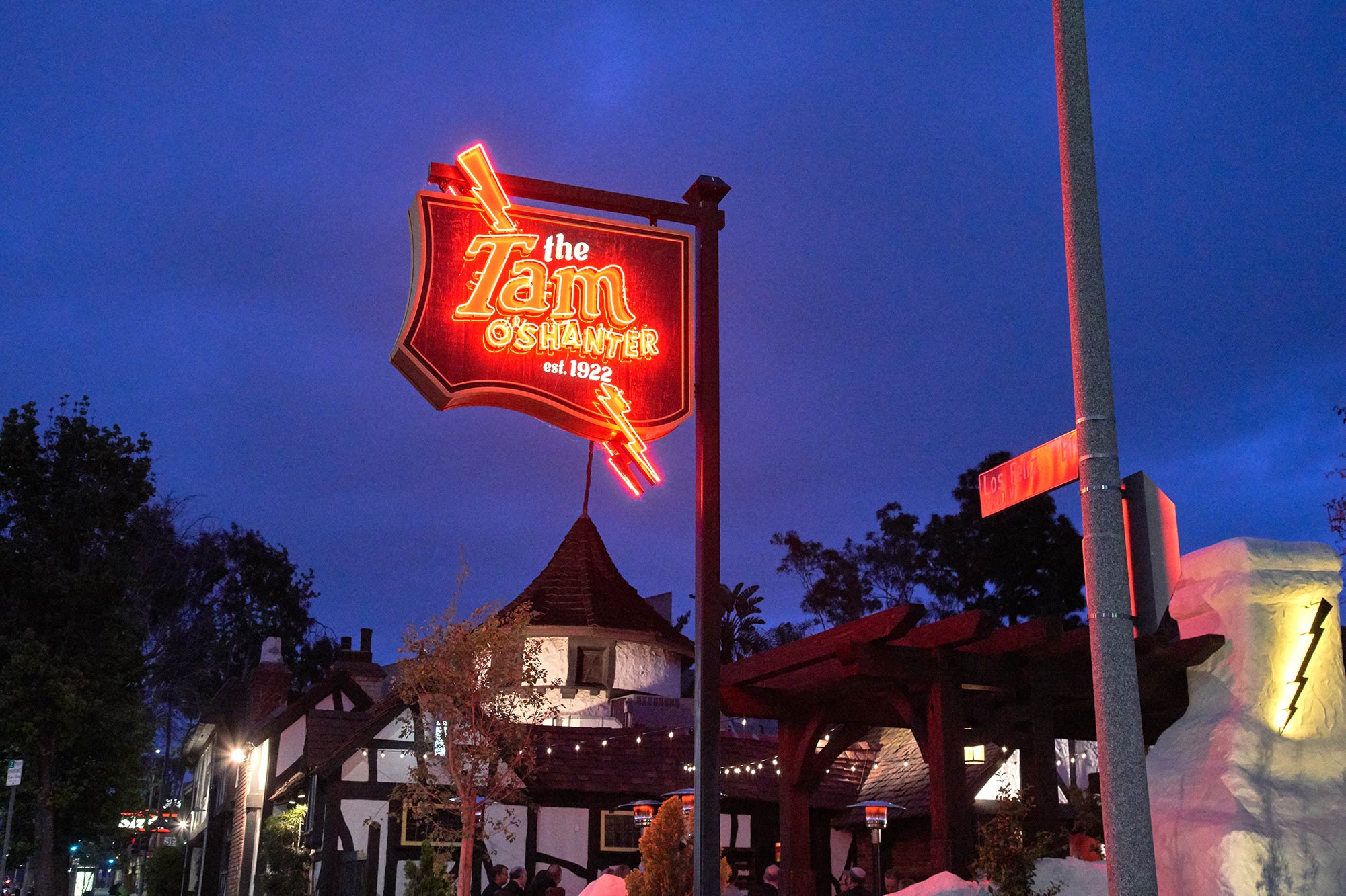
Photo courtesy of Ryan Tanaka
Outcome
Design Means Business
Within a year of the rebrand and menu changes in 2015 revenues were up nearly 30% and guest count was up over 30%.
What's more, guests regularly pose with the sign and include menus and coasters in their social media posts, creating a echo effect and free marketing for the brand. The gold standard for great food and thematic dining in Los Angeles has regained its luminous luster.
The Tam O'Shanter: 2980 Los Feliz Boulevard, Los Angeles, CA 90039